
WebMD Lab Testing
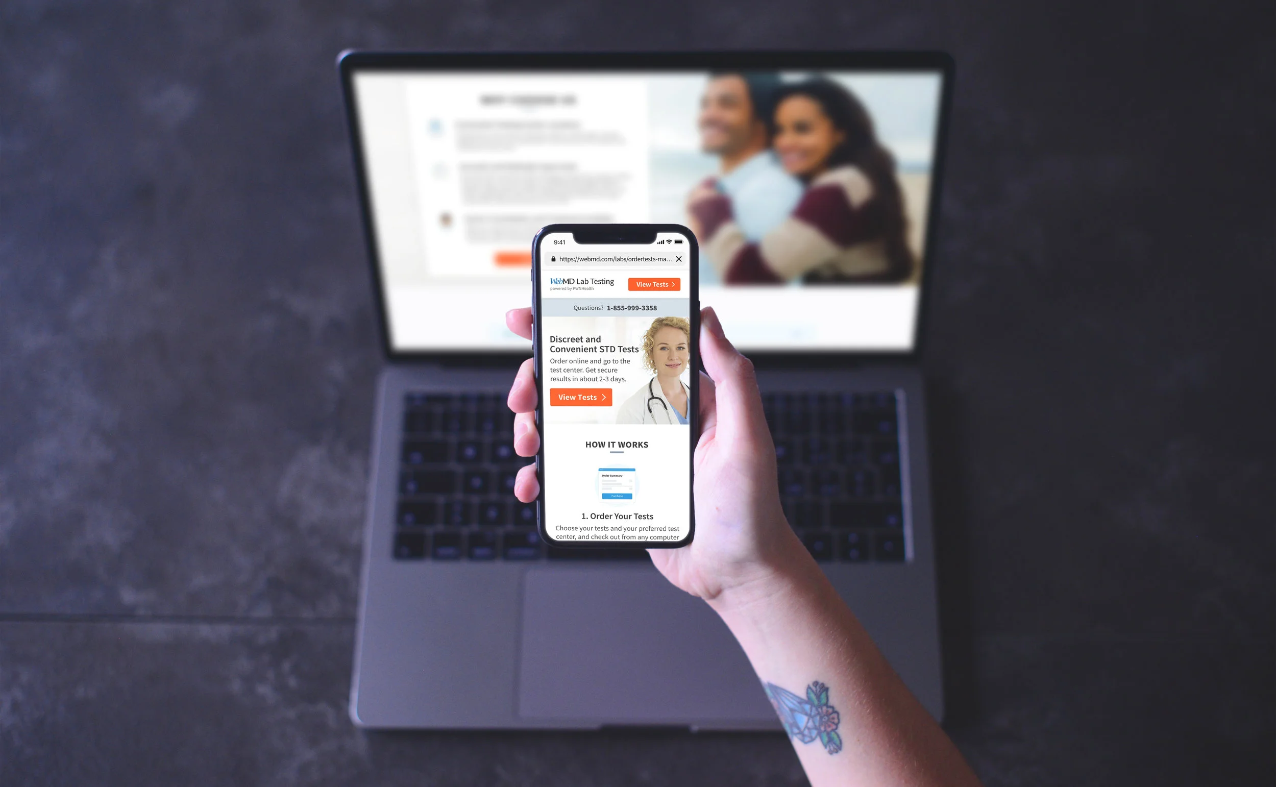
This was a brand new product for WebMD and the company's first attempt at entering the ecommerce sector. Since WebMD is the leading provider of health information services to consumers, we thought the next natural best fit would be to offer testing and treatment services. We started the venture by offering consumers the ability to get tested for STDs. Due to confidentially purposes, exact numbers of success and tests have been omitted.
Goals
To create a new product that consisted of
A landing page that describes the service
An easy payment process so people could purchase the product
Consistent emails that could be used to communicate to the user
Clear results page that showed if a user was infected with an STD and how to receive treatment if necessary
My Role
I am the lead designer in charge of this massive undertaking, and I am continuously working on this project. This project involved product managers, front and back end developers, UX designers, business stakeholders, medical editorial team and doctors, legal, and marketing strategists. In order to deliver at scale across the continental US, WebMD partnered with PWNHealth. In addition to coordinating with the WebMD team, I also had to coordinate with PWNHealth's team of legal, business stakeholders, front and back end developers, and product managers. Over 50 people touched this project in some capacity.
Design Process
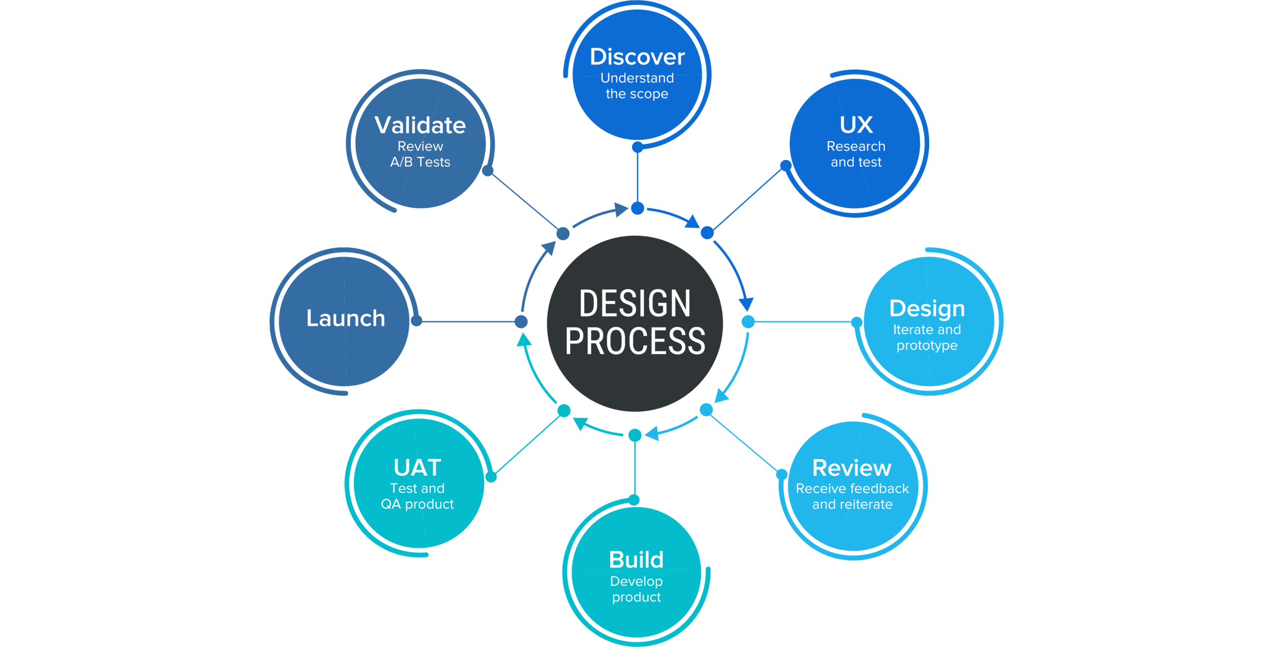
This project has been continually refreshed and redesigned for over 1.5 years and counting. New features and refinements have been continuously added to this project in order to enhance the user experience. In general, the design process has been like the flowchart below.
Part 1: Landing Page Case Study
Overview
The landing page is where consumers can learn about how to purchase a lab test. On this page, the different types of STDs are listed and a user could select which one best fit his/her needs. This page also explains how the test would work, the benefits of the test, and frequently asked questions.
Competitive Research
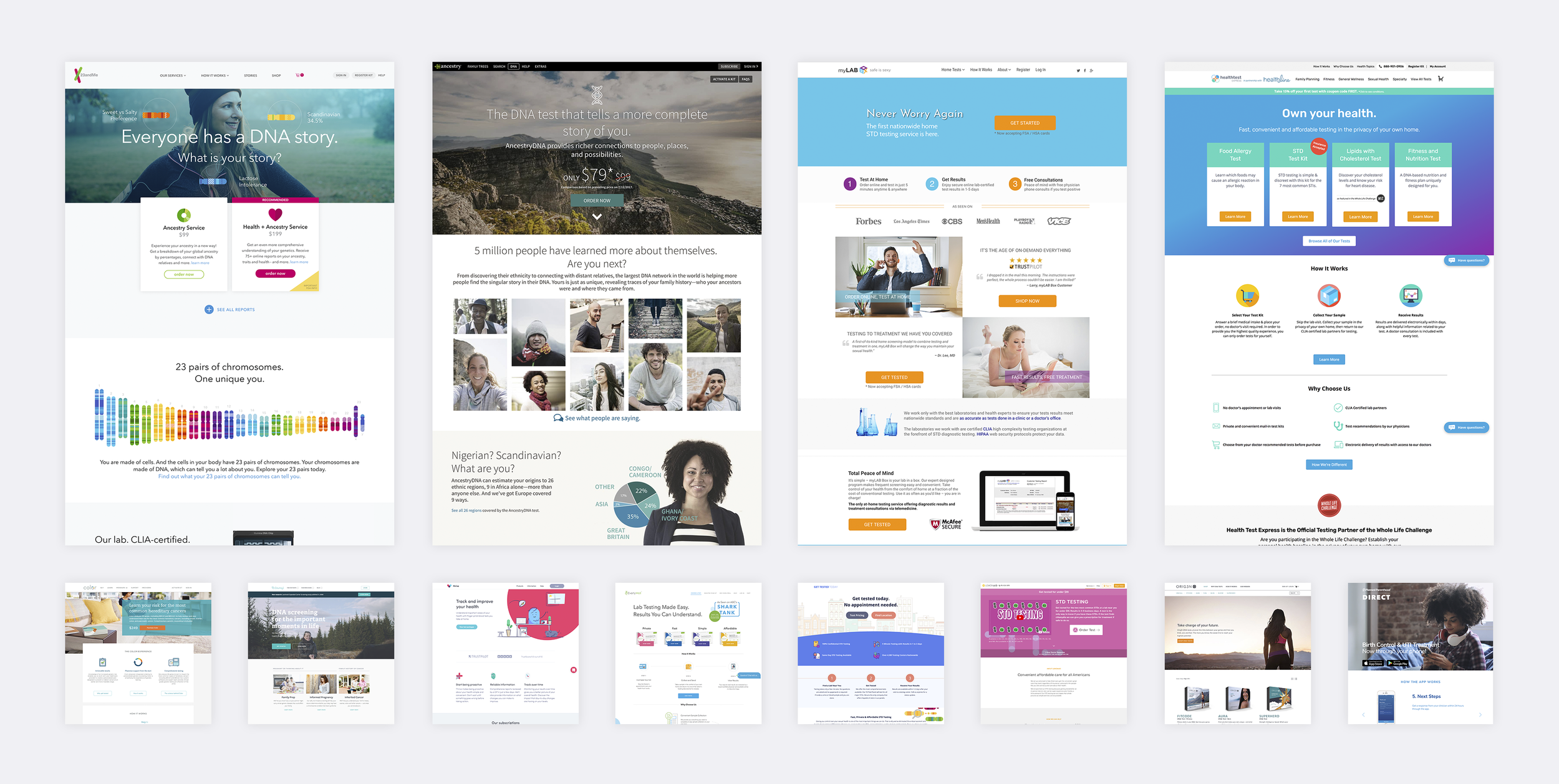
For this project, I did a lot of research and I looked at competitors in the space. I had these questions:
What are the competitors doing and how are they positioning themselves?
How is the content prioritized?
How are they targeting consumers?
What was the competition’s product offering and price point?
Where could the competitors improve?
Wireframes
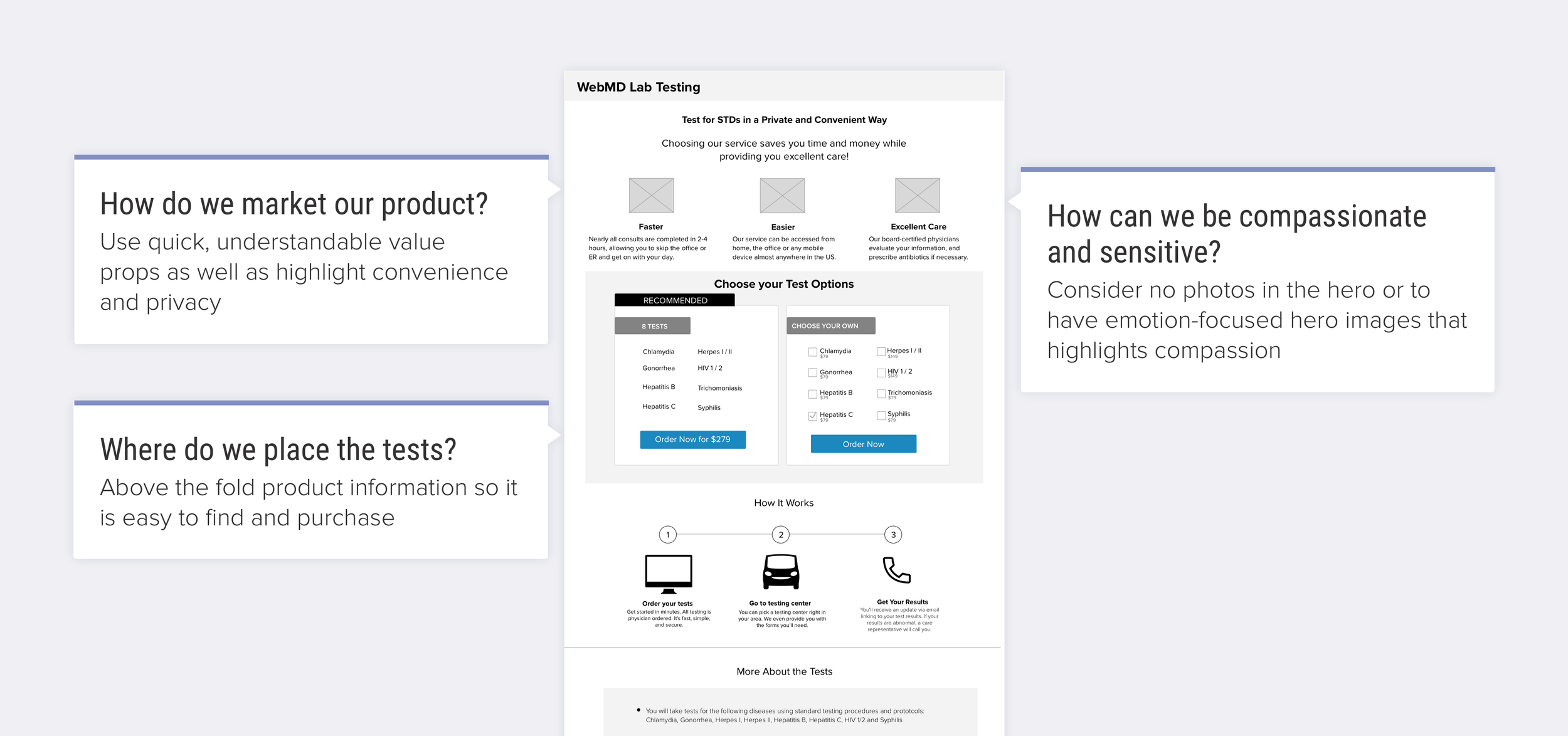
From there, I was able to work with the UX designer to create a wireframe. We wanted a design that exhibited the following traits:
Sensitive and compassionate. STDs could be a scary diagnosis and we wanted to make sure that we were being considerate. We tried out a landing page that had a photo-centric hero and one that did not.
Easy to understand. We wanted to make sure that the value props of the product were clear and easy to find. We wanted to convey how this was a convenient product. We also wanted to stress that privacy was our top priority.
Clear call to action. We wanted the product panels to be above the fold line so it was easy to find and purchase.
Launched Landing Page
After reiterating and conversing with various stakeholders, I was able to come up with two different designs. There were concerns about the placement of the Call to Action button and the placement of the panels. We wanted to see if it was important to have the Call to Action higher up on the fold. We also wanted to determine the value of laying out the panels as side by side versus being stacked. We ran these two landing pages as an AB Test and reevaluated at the end.
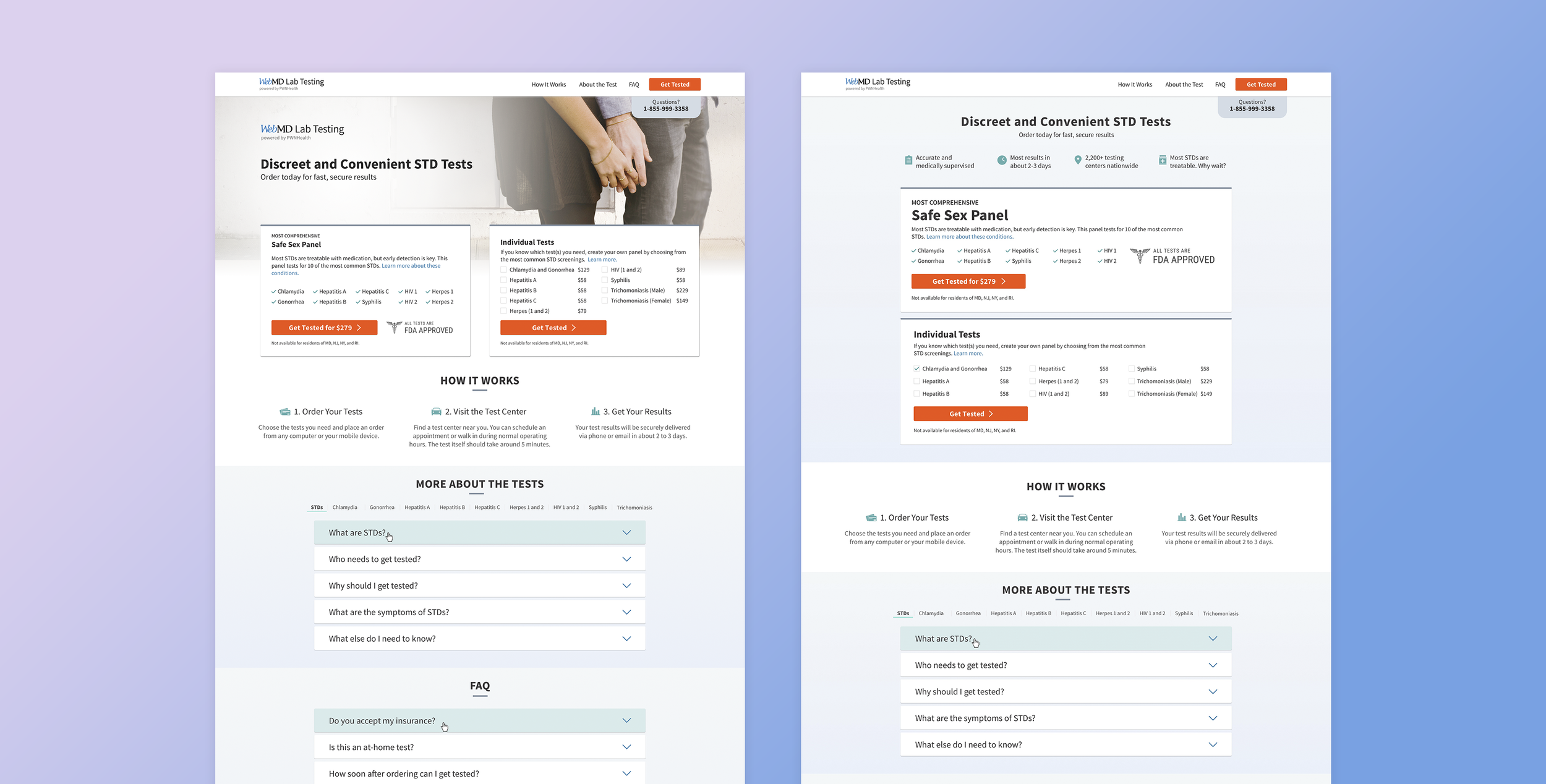
Data Review
We had Mouseflow data available and a feedback form to gather additional insights. Mouseflow is a third party vendor we use that can show us videos of users working through the flow. Mouseflow does not show us any sensitive or any identifying information. Mouseflow provides heatmaps to anonymously summarize where people click or touch, move the mouse, scroll, and pay attention. Below is a summary of user engagement and where people drop off from the landing page. The feedback form was initiated if a user used the back button to exit the WebMD Lab Testing experience.
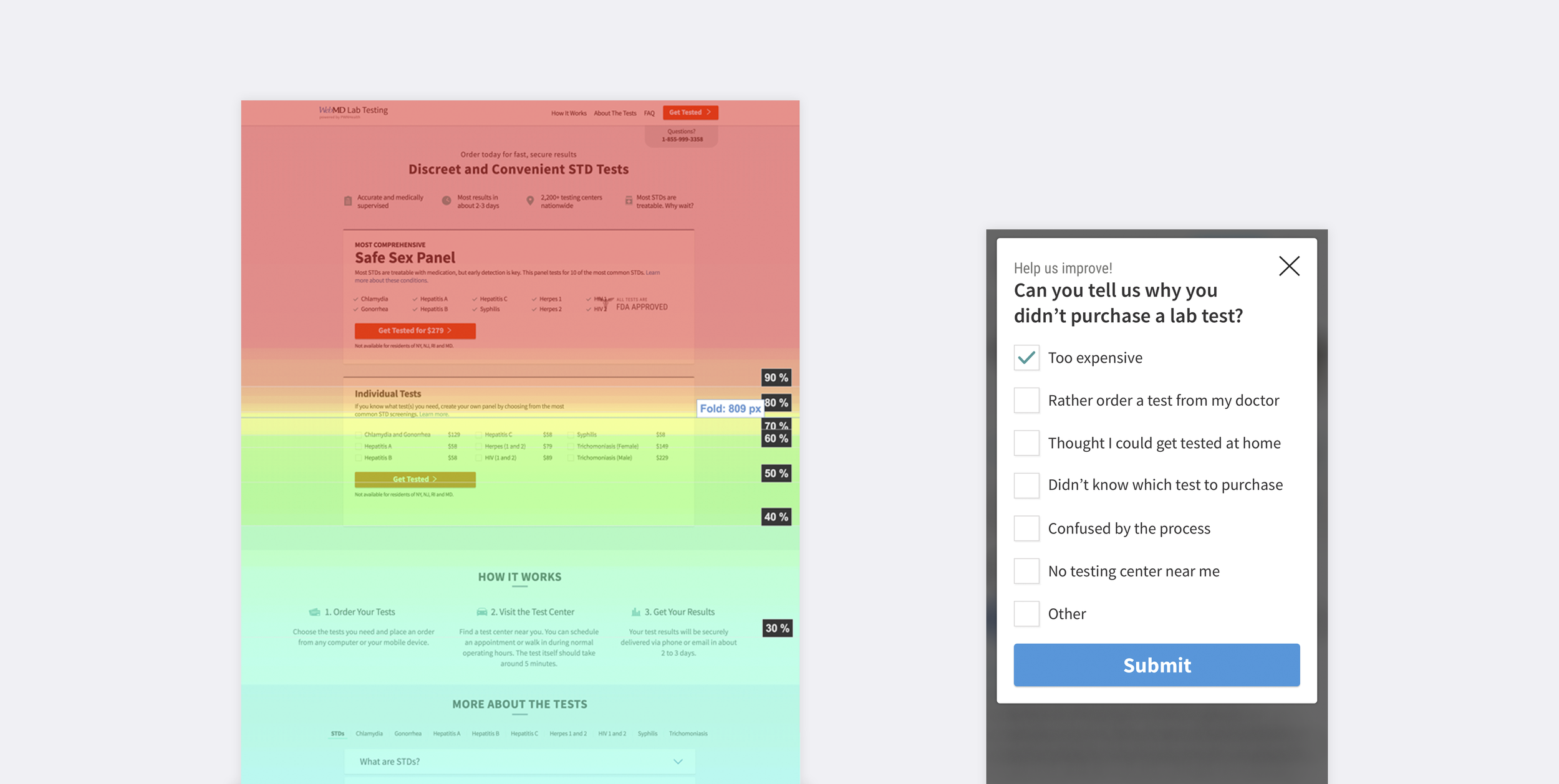
We determined from the test that many people were not scrolling through the landing page. We believe it is because of the high price point and the aggressive placement of the purchase button. I decided to address these concerns with a less aggressive call to action button of “View Tests” instead of “Get tested for $279.” The idea was to create an emotional response through imagery to convey trust and comfort. The positioning of the price was moved out of the button in order to not highlight the high price point. In addition, the business agreed to lower the price to a more competitive price point.
We also noticed that people were not truly understanding the product and did not know how it worked. We received feedback that people thought it was a take home test instead. In order to address this, I changed the iconography to be bolder and more straight forward.
In this particular test, the photo proved to be a valuable metric in creating trust and credibility. The landing page with the photo was able to produce more sales then the non-photo landing page. We tested three other photo iterations to see what was the best result.
The end result was this new landing page and product selection page.
Final Landing Page
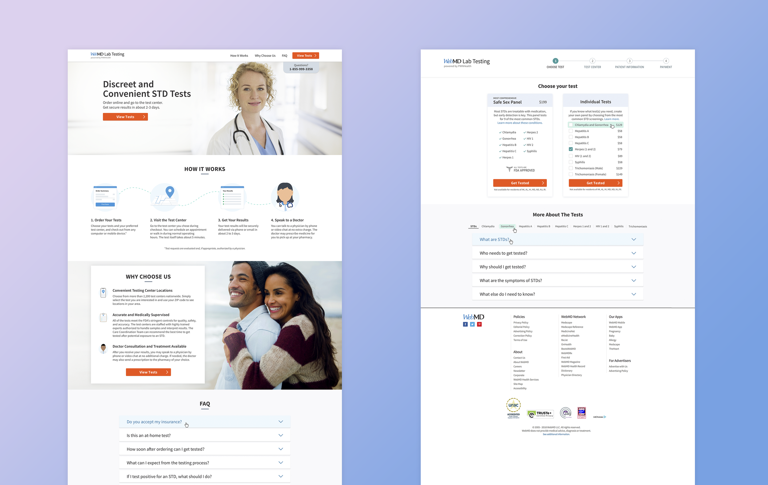
We are currently testing the success rate of these new product pages and it is so far leading to better sales.
Part 2: Payment Process Case Study
Overview
The payment process followed these steps:
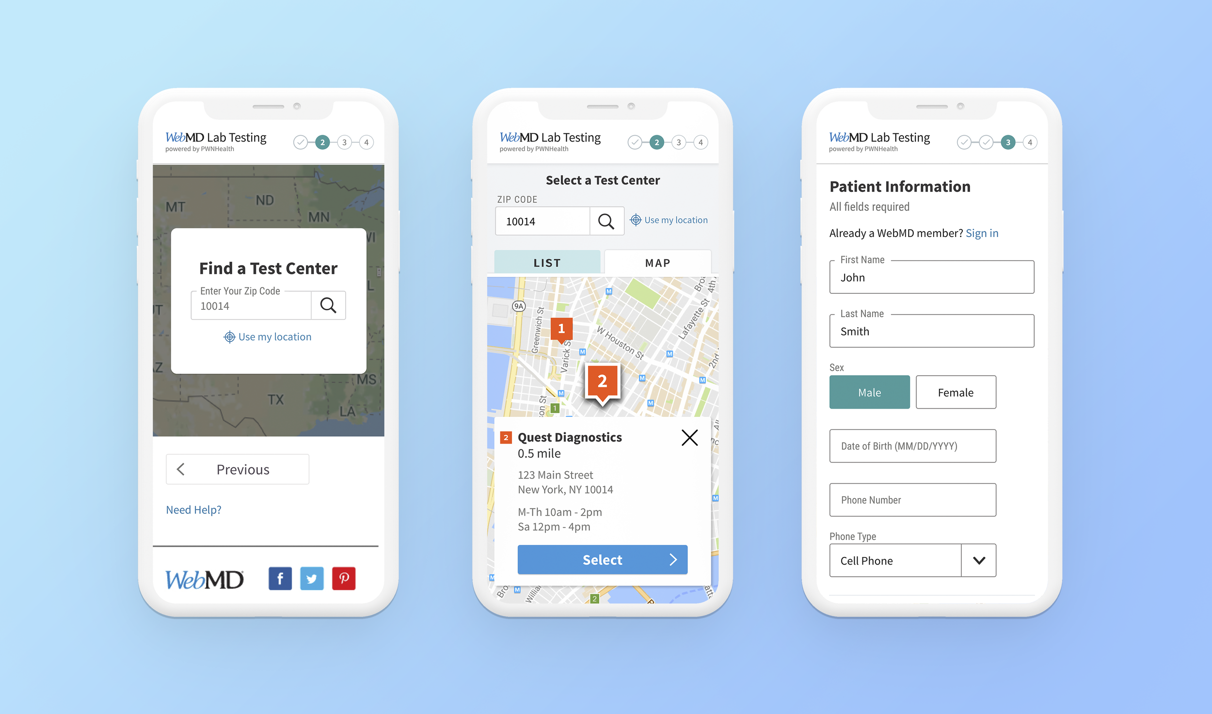
1. Select a test center. After choosing the appropriate STD testing panel, the user uses a map to search for the closest test center.
2. Information for the lab. The user fills out a short form with information that will be used by the lab for testing purposes.
3. Creating an account. The user enters an email and password that will be used to access his or her results. In addition, the user must add a phone number so they can be contacted if necessary by a doctor.
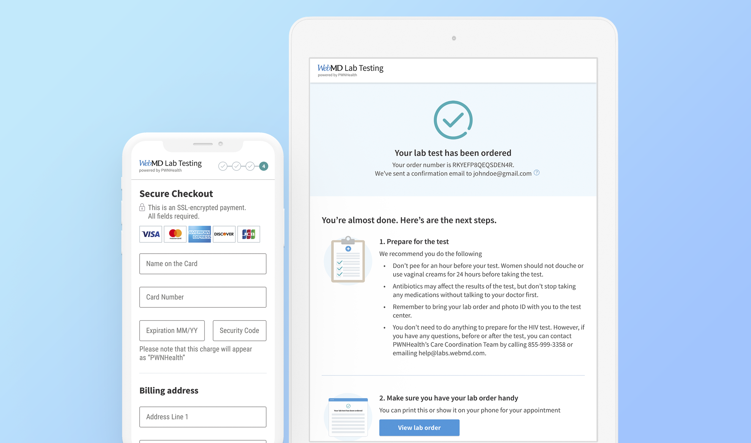
4. Billing information. The user fills out his or her billing information and purchases the STD test. Since the STD test is purchased, the user can go to the test center and get tested by a professional.
5. Confirmation. The user receives instructions on how to prepare for the test, where to go to get tested, and how to access results.
Competitive Research
For this phase, I wanted to look at the leaders in the ecommerce industry. I looked at sites such as Amazon, Ebay, Walmart, Target, Etsy, Groupon, and more. In addition, I looked at companies that were in the health testing industry. I wanted to learn the following questions:
How many steps were involved in the checkout phase? Was there a navigational bar?
How did they position the checkout cart? How could you edit it?
How are the form fields displayed?
What is working and what could be improved on?
What was on the confirmation page and how did they arrange their content?
Wireframes
I worked closely with the UX designer to create wireframes for the process. Originally, we wanted to place everything onto one page, like most of our competitors. However, due to domain hosting and legal limitations where PWNHealth hosted some information while WebMD hosted the other, it was impossible to get everything onto one page.
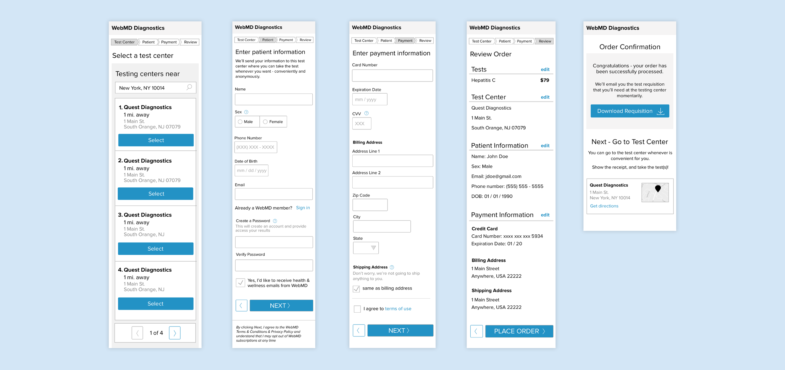
Launched Designs
The designs had a unique header completely different from the landing page. This was done in order to create a navigational flow that was focused on checking out. I wanted to create as few steps as possible in order to make it a painless checkout process. Consequently, the review page for an order was eliminated in the final designs in comparison to the wireframes. In order to save space, on mobile, the checkout cart was only added to the last screen. It also helped discourage people from abandoning or changing their cart.
Data Review
We noticed that many people who landed on the first field form abandoned the page. Our Mouseflow data showed that people would scroll up and down, but they would not fill out the page. We hypothesis this is because there are many fields that we ask a user to fill out. In addition, a lot of these fields are personal information, and we assume that most people who order a STD test would prefer to give as little information as necessary. We ended up revisiting and modifying the field forms.
Post Launch Design and Interaction
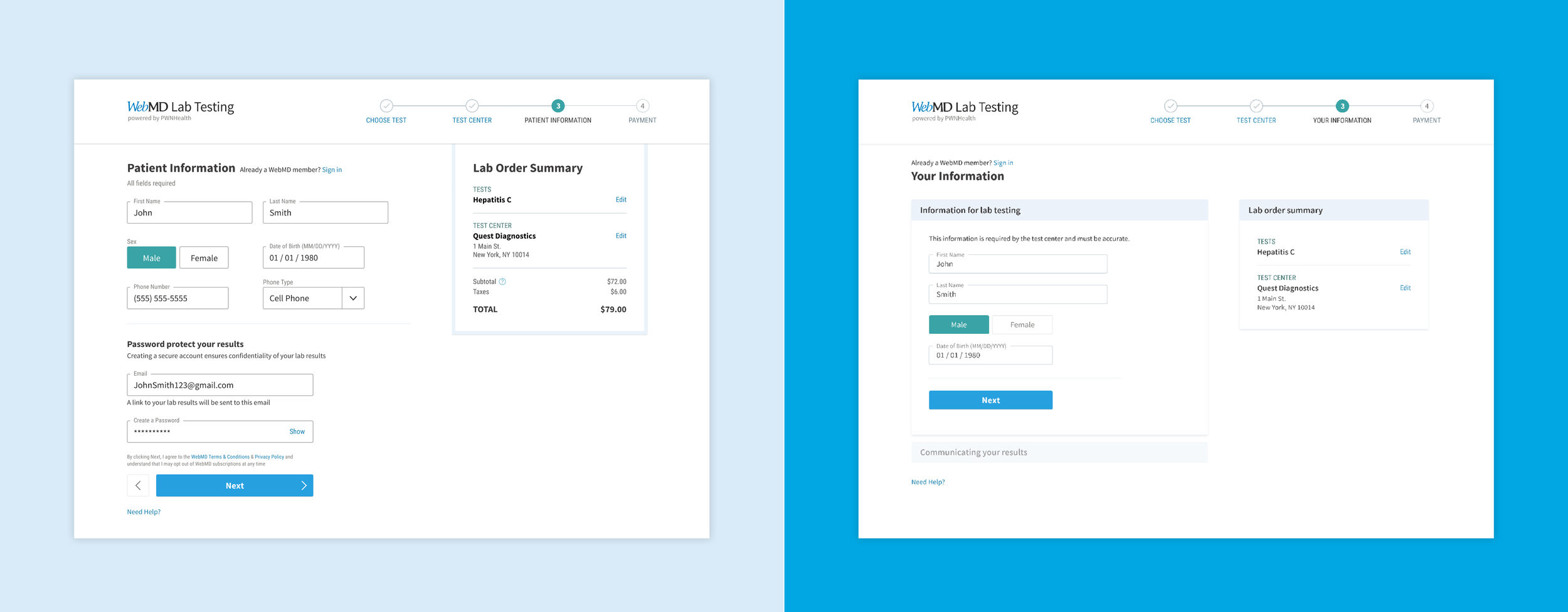
The old design is on the left and the new design is on the right. Instead of having 8 fields to fill out, a user only had to fill out 4 when they first land on this page. I grouped some of the fields into different sections in order to make the size of the form feel shorter. I also used a softer color for the form so it felt less harsh and intimidating. Furthermore, I eliminated the prices in the Lab Order Summary box in order to not overwhelm the page as much.
I also added a friendly animation that occurred when the first half of the field form was completed. This quick microinteraction was added to help enhance the user experience and provide a smooth transition between the two sections. Furthermore, I used animated helper text for the field form. These animations help guide a user through the form. As a UX best practice, I wanted to make sure the helper text did not disappear when a user interacted with the form. By having the helper text animate up, it was not intrusive as well as it did not overly clutter the space.

In addition, I added an account verification notification. This occurs when a user verifies his or her email. I wanted something that would grab attention in a classy way. The one that is live on the website does not loop; it is only looping below for presentational purposes.

All these changes helped drastically improve completion rates and ultimately lead to greater sales.
Part 3: More WebMD Lab Testing Components
This extensive project had many other components involved. Here are some of the other designs used in the project.
Designing the Logo
WebMD has a variety of consumer brands and tools. In order to build unity, it was necessary for the WebMD products to have a consistent logo style. WebMD Lab Testing was the first product to use the logo style guide that I created. This style would be implemented across the other products such as WebMD Symptom Checker and WebMD Relief Advisor.

The logo uses Source Sans Pro Regular, which is the main font used on WebMD. It also uses a dark black instead of a pure black because pure black tends to contrast too heavily and is harder for a user to read. The logo is versatile for different sizes and is easily recognizable.
Iconography
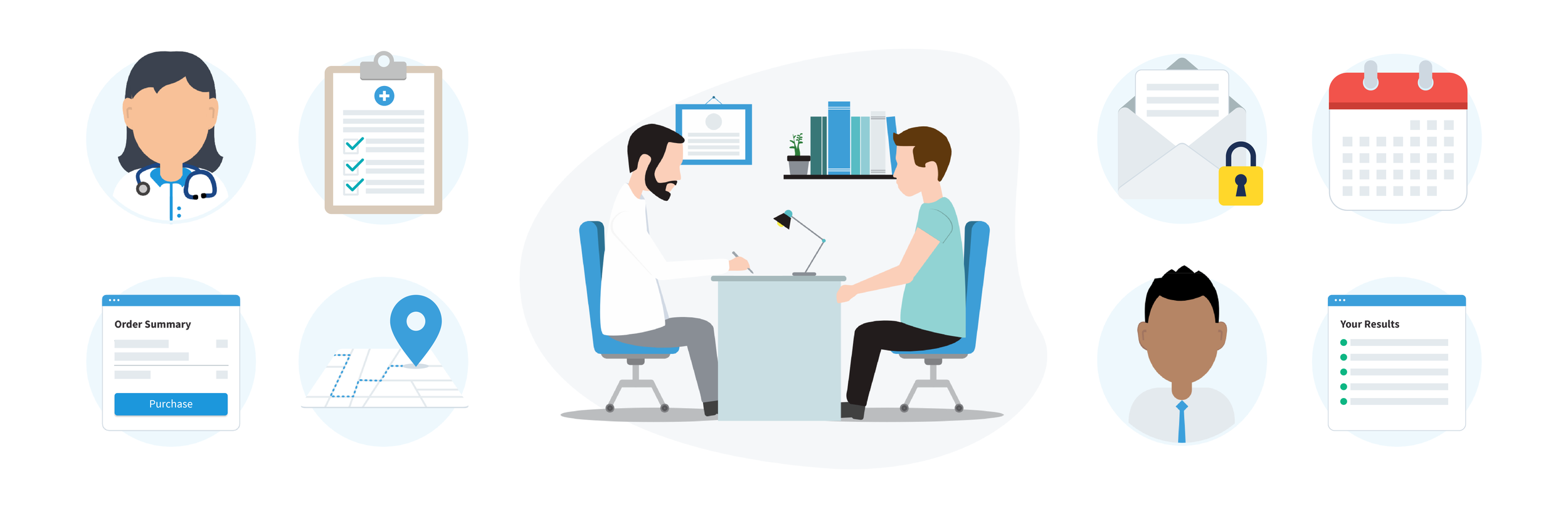
Using a modern, flat style, I created this icon set to complement different scenarios. I wanted to create a set that looked consistent with each other as well as help explain certain user flows more elegantly. I chose to make them similar in size, shape, and color. I wanted to avoid being too playful since I did not want to change the tone of the product. I chose to use blank faces to make them feel more universal.
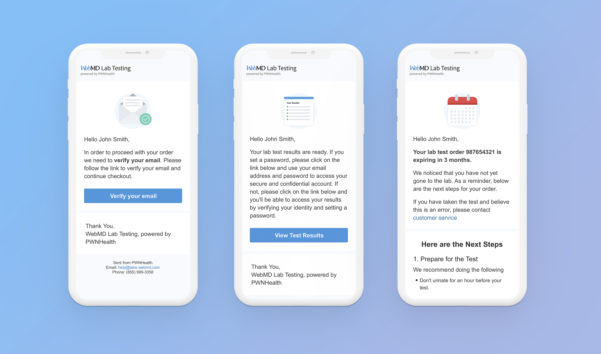
Emails
WebMD Lab Testing chose to communicate to the user through emails. I chose to create a template that involved some iconography, clear call to action buttons, a similar color palette and a unified branding identity. I wanted to make sure the series looked consistent and from the same company, so I made sure to use the same header, footer and typography throughout the series. I chose Arial as the main body text because it is a safe font that renders correctly for most email clients. The emails were concise and straightforward with a clear sense of hierarchy.
Lab Results Pages
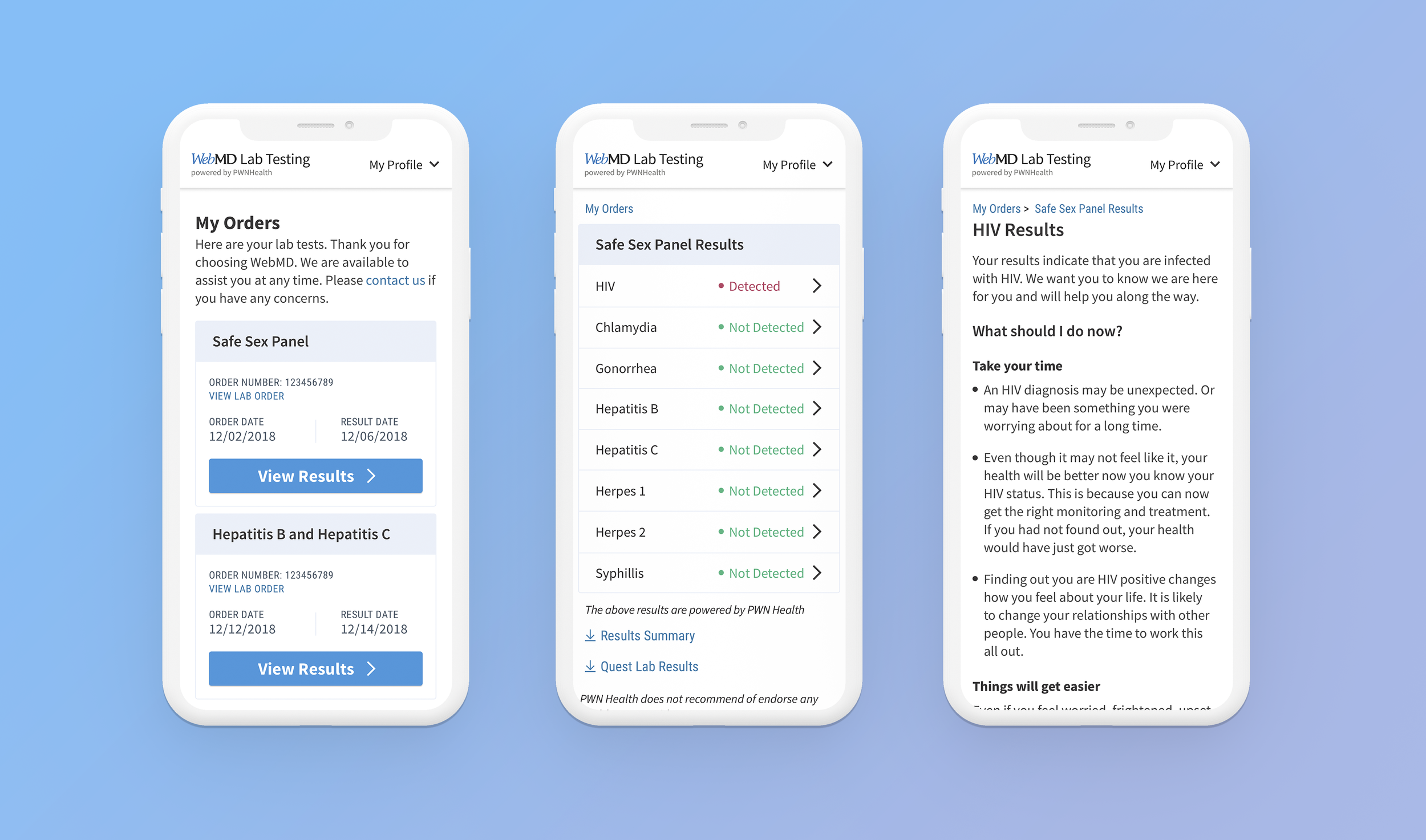
After a user has gone to the lab test center, the user will receive an email notifying him or her that the results are available to see online. A user needs to login in order to see the results. The below is a sample screen of a possible outcome. I used straightforward words such as “detected” and “not detected” to eliminate confusion. For example, some other words we discussed were “negative” versus “positive,” which are both more commonly found in the medical field. However, we found it might be confusing since a “negative” reading is medically good, but at the same time, we were afraid that people might misinterpret “negative” as being “bad.” In addition, I decided to keep a similar styling as the payment pages in order to build a consistent product. I used color as an indicator on the dashboard to make it easily scannable. For the results page explanation, I wanted to make sure that the language and tone was sensitive and empathetic. I wanted to make it easy to navigate through with meaningful content.
Overall Results
In closing, this project has been financially fruitful for WebMD. Orders have been steadily rising each month.