
Medscape Continuing Medical Education (CME)
Continuing Medical Education (CME) is a staple pillar for Medscape and allows physicians to take free classes and gain credits. In every state, it is mandatory for doctors to complete a certain number of credits each year in order to stay accredited. These educational sessions serve to maintain, develop, or increase a physician’s knowledge and skills.

Goals
To redesign the four CME section including
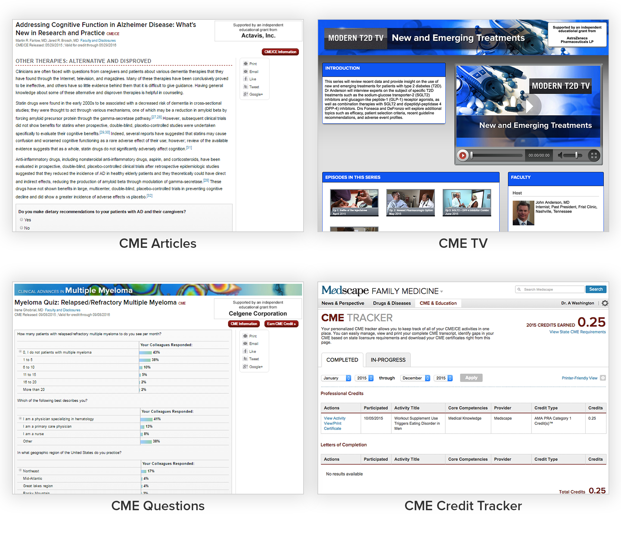
CME Articles - These are long form articles that teaches crucial medical information
CME TV - This is a video destination center that teaches a specific medical topic
CME Questions - This is the short quiz that physicians answers at the end of the topic
CME Credit Tracker - This is a dashboard that tracks how many credits a physician has finished
My Role
As the lead designer, I was charged with the task of rethinking and recreating our CME Activities, CME TV, CME Questions, and CME Credit Tracker. I needed to balance the needs of the sales force as well as the users, which tended to be opposite desires. I wanted to be mindful of how to design to scale as well as create a responsive redesign that addressed all of our problems. I worked closely with the project managers, medical professionals, front-end and back-end engineers, QA team, business and sales team, and the UX and design team to solve old problems. Including myself, there were 35 people working on this project due to the vast scale and importance of this project.
Design Strategy
Discover problems and understand the requirements. I needed to become an expert at understanding what is CME, define user problems, and research competitors.
Explore design options with wireframes and user testing. By working with the UX designer, I was able to understand the user’s expected behavior and patterns.
Design solutions and build prototypes and high fidelity mocks. Through Sketch and Invision, I was able to show end to end flows based off of UX Wireframes.
Refine, reiterate, and review designs. I presented designs to project managers and stake holders to confirm we reached all the business objectives and fixed all the problems we discovered. I shared work with engineers in order to find the best feasible options that will work at scale as well as identify any potential problems and solutions.
Once approved with all parties, work with project managers and developers to define and scope sprints and stories. There was a continuous feedback loop of previewing code, reporting bugs, and fixing errors.
LAUNCH DESIGN!
Perform retrospective. We wanted to monitor how CME was performing and where improvement can be made.
Old Design and Problems Discovered
Across all of the 4 products, I discovered these problems:
Not mobile friendly. With mobile traffic growing every month to Medscape.com, it was imperative to create a mobile optimized website. We wanted to make it responsive for all breakpoints.
Outdated design. We wanted a more modern design across all activities to remain competitive. We wanted a smoother user flow journey, better pagination, a consistent experience, better question and answer experience
For CME Articles and CME TV, I had these problems:
No uniform look across thousands of pages. There are thousands of CME activities across Medscape. Unfortunately, many of these activities used a variety of different modules and added customized details in their activity. It was imperative to create a sense of unity between the activities and at the same time be flexible enough to meet the needs of partners, sponsors, business goals, and users.
Low completion rates. Drop-offs occurred for the longer CME activities. It was hard for a user to know how long the activities were beforehand. We wanted to help doctors navigate through the material more seamlessly and quickly. Increasing completion rates was a large priority.
For CME TV, I had this problem:
Hard to discover new CME Videos. CME videos existed on a landing page, but beyond that it was hard to find related CME videos. We wanted to create an experience that encouraged doctors to watch consecutive videos.
For CME Credit Tracker, I had these problems:
Confusing credit tracker. We needed to make it clearer to the users how to determine how many CME credits they needed for their state. We also wanted to create a printer friendlier version so they could easily submit it to for approvals.
No way to save CME activities. There was no feature to bookmark or return to a previous CME activity. We thought that doctors might be interested in completing activities at a later date if their workload was too large. We hypothesize that if the doctor could return to a previous CME activity then they would be more likely to complete and finish an activity.
No personalized CME activities for each user. We wanted a recommended section that targeted doctors who were interested in specific conditions, diseases, or specialities.
Exploring Design Options
Created by the UX designer, we were able to test user flows and see if the process was clear. We wanted to see if we could increase user completions and create a design that could be used at scale.

Designing solutions for CME Articles
The new design is structured with space for everything from educational content to inline surveys and charts. A right rail was created to address business needs such as various download links, social links, and sponsorship information.

Designing solutions for CME TV
To better serve our users, the videos were moved to the top of the homepage so they were easily discoverable. The new design helped connect the overall theme between the Homepage and Articles as well as encouraged users to watch related videos in the same category. The video player received a refreshed look with new controls.

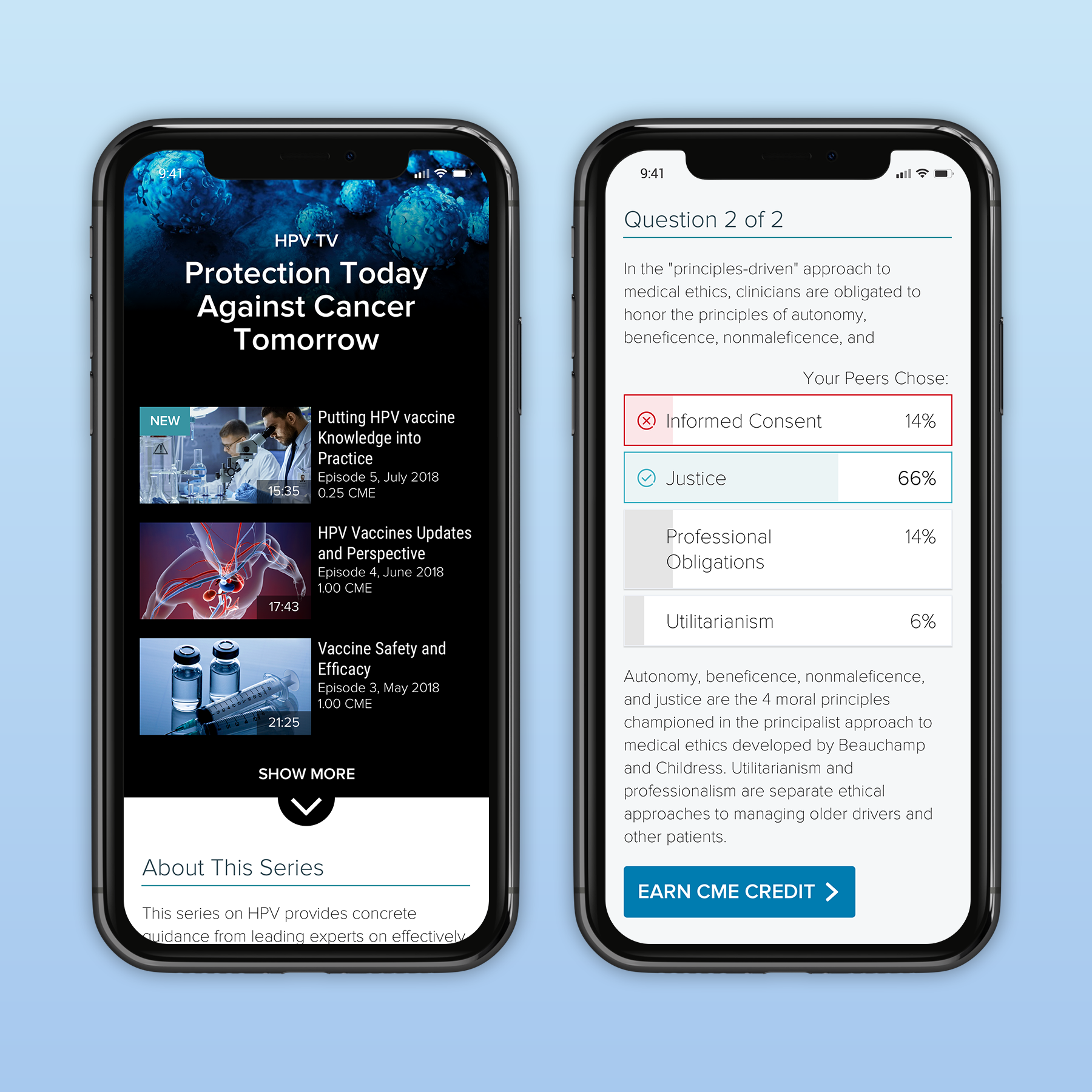
Designing solutions for CME Questions
Using visual cues and new iconography, this design helped the user quickly identify their results, what they selected, and what their peers believed the answer was.

Designing solutions for CME Credit Tracker
The redesigned credit tracker allows our users to easily see and print their total amount of credits, discover new CME activities and filter based on their needs.
Results
The new CME design has been adopted to all past and future CME Activities, CME TV, CME Questions, and CME Credit Trackers. This redesign created cohesion, order, and allowed users to understand vast amount of knowledge within a simplified user flow. Overall, we saw a steady rise in completion rates.