

WebMD “Living Healthy” and “Family and Pregnancy”
These two lifestyle brands of WebMD were landing pages for videos, articles, slideshows, and useful tools. The Living Healthy section is dedicated to empowering users with credible advice about diet, fitness, healthy food, beauty, and how to live well. The Family and Pregnancy section is a powerful guide that helps parents raise a family from the first trimester through to the teenage years. These two sections were not mobile optimized and needed a refresh to match the rest of the website.

Goal
To create a responsive layout that works for both the “Living Healthy” brand pillar and the “Family & Pregnancy” brand pillar at WebMD.
My Role
As the lead designer, I was in charge of creating designs, showcasing high fidelity prototypes, coordinating with developers and project managers, and performing UAT. This was a small team of about 8 people under a tight deadline of 2 months.
Design Strategy
Discover user habits. I worked with the UX designer to analyze heat maps to understand what users believe to be the most important content on the page.
Design high fidelity mocks. By using Sketch and Invision, I was able to reiterate efficiently and effectively. After reviewing with the design team, I created all final assets and prepared the files for the engineers to develop
Work with the engineers to build the pages. I provided continuous feedback in order to ensure a fast delivery in our agile process.
Analyze results. It was important to determine the redesign effectiveness through quick user feedback.
Problems Discovered
Not mobile friendly. The sites were not mobile optimized. With the announcement that Google was prioritizing mobile friendly websites in their Google ranking algorithm, it was imperative to optimize the sites. In addition, mobile traffic has been steadily increasing and it was necessary for the business to adapt to the changing consumer behavior.
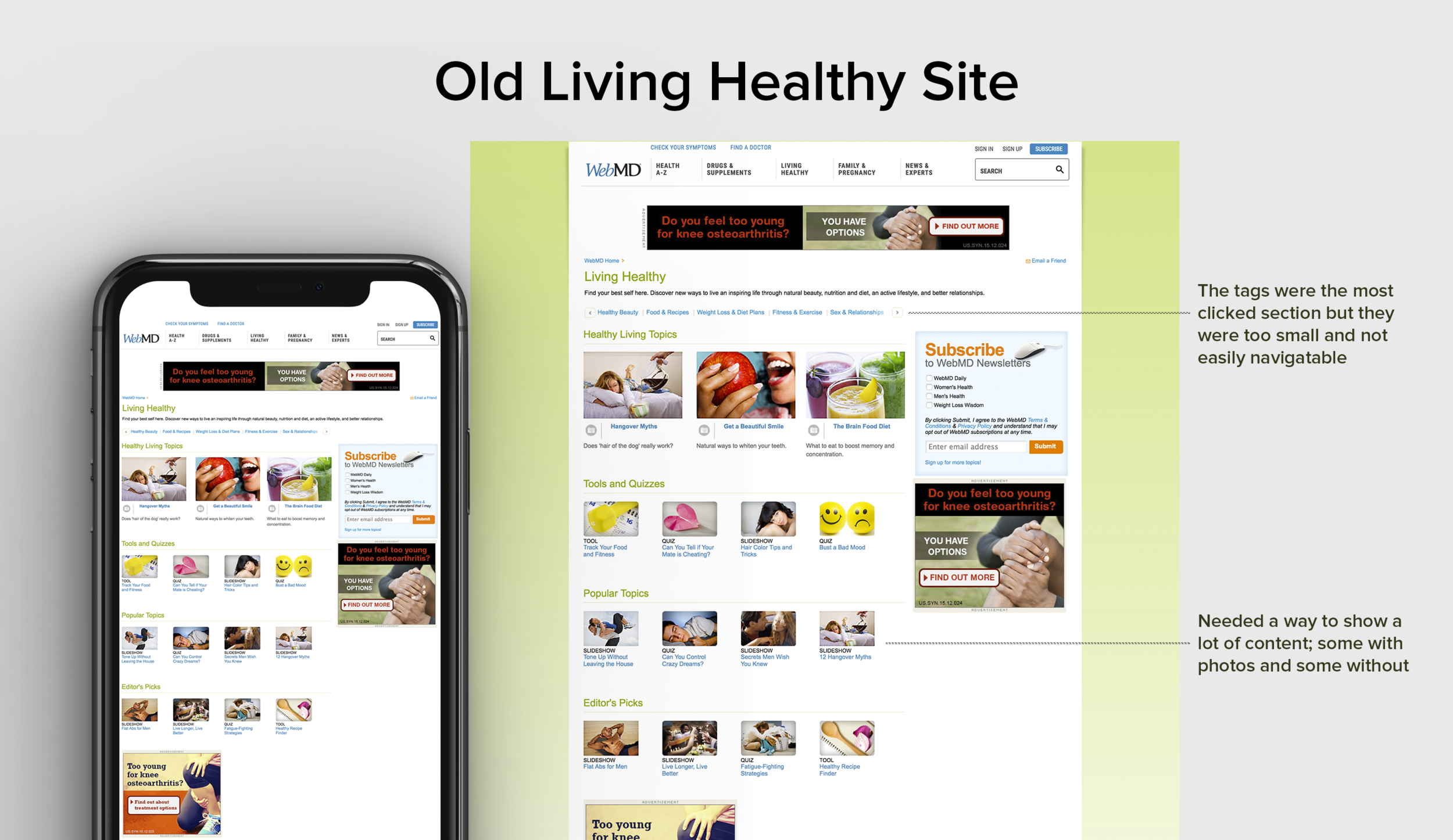
The most clicked on sections were buried in a carousel. Our heat maps data showed that the tags in the carousel were highly popular amongst our consumers. We wanted to highlight these key words and make them more noticeable.
Needed to improve ad viewability. The ads needed to be viewable above the fold to maintain business goals. There is a higher ROI correlated with improved viewability.
Needed a format not reliant on pictures. Not all the content had pictures, so the pictures chosen needed to be evergreen. The goal was to create a news feed that relied more on typography instead.
The tools were scattered. The tools were buried within the content and were not easily discoverable. We wanted to highlight them and increase their noticeability.

Designing the New Sections
I organized the content into easily understandable bits of content. The highlights of the new design include:
Mobile friendly. I redesigned the page with a mobile-first mindset. I made sure that the content was readable and easy to click on.
New tags to easily find relevant content. The tags were the most clicked on links, but were buried in a carousel. The new redesign made the tags bolder, bigger, and the highlight of the page.
Improved ad viewability. By moving the subscription module to the center well, the paid 300x250 ad in the right column was able to move higher up on the page. The custom in-line subscription module also captured the user's attention more efficiently. Improving ad viewability was a large business objective, and we were successful in accomplishing it.
Strong typography instead of relying on pictures. The color scheme of each section is mimicked throughout the header, headlines, and icons. It was important to develop a strong typography feel since the photos would not be easily swapped.
Refreshed tools section with new iconography. I repositioned the tools to be higher on the page and more noticeable with a clean color palette.


Results
The results showed an increase in page views and consumption immediately following the redesign. Because of the success of these pages, some elements were implemented across other parts of WebMD. (ex: The tags style is being used on the homepage of WebMD.com)